Chaos & (B)order Photos
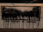
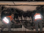
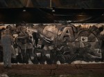
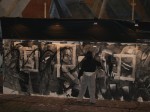
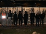
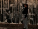
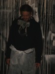
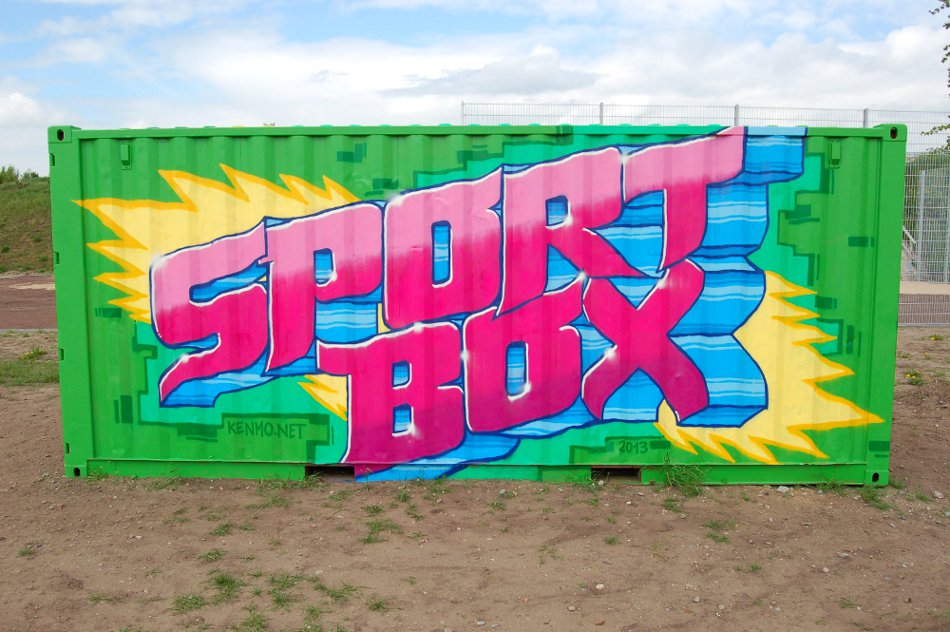
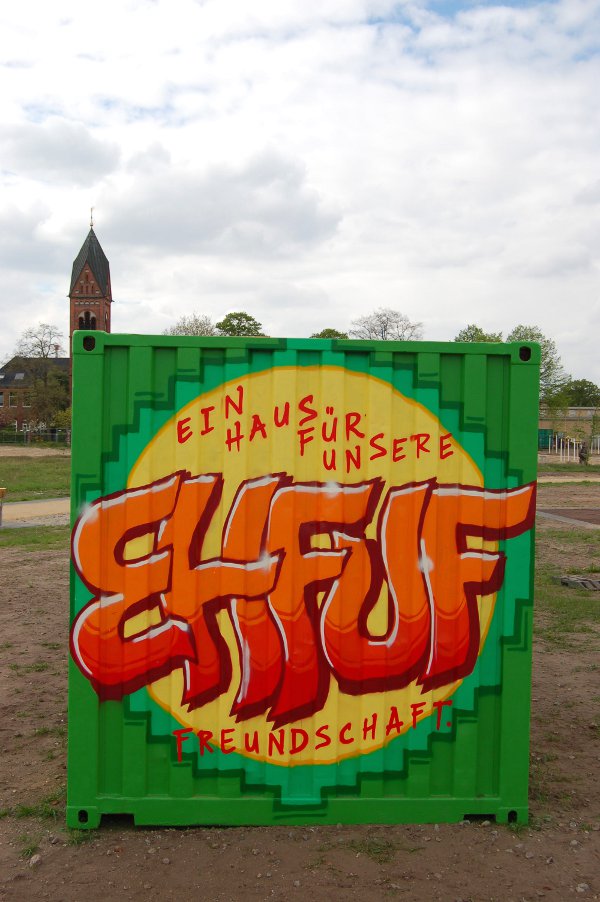
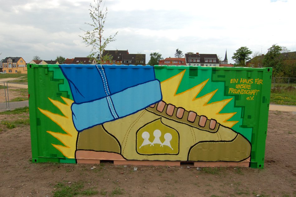
I just got a whole load of photos of the latest performance!
Seemingly it wasn´t easy to get good photos in the half-dark arena...
The video is coming soon, though!
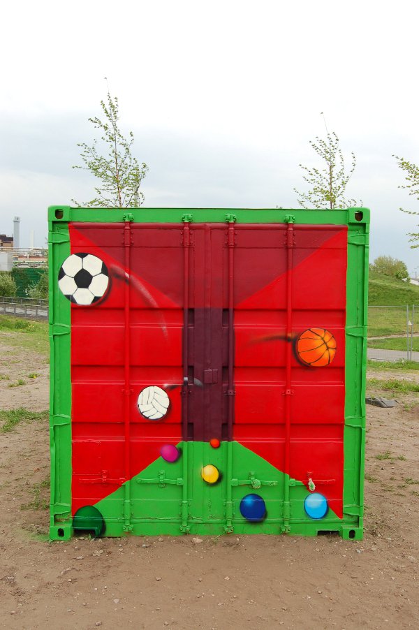
“Weyhe ist bunt”
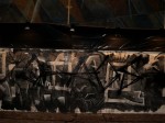
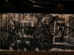
Another school yard got painted and "Weyhe is [a little more] colourful" now!
It was the pupils´idea to paint a train on the wall, and on it the graffiti. The slogan is meant as an anti-xenophobic, or pro-multicultural statement in town. I thought it was very appropriate to what we did as well.
Hass
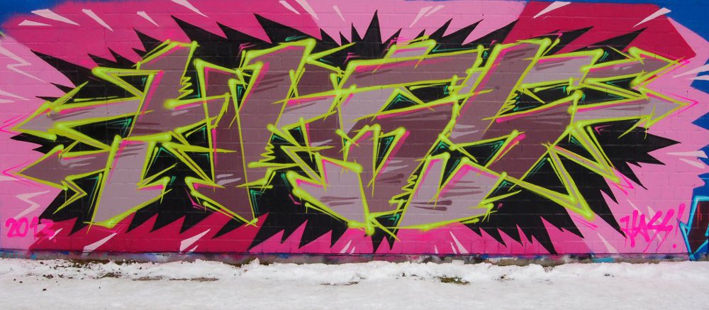
I painted this piece today at about -5°C, so I worked as fast as I could.
I often have the impression that english words, especially curses, sound more harsh and 'on point' than the german ones. In this case I think it´s the opposite, "hate" or "hatred" doesn´t seem to have the impact of the german word "Hass" in my opinion.
Don´t get me wrong: I´m not promoting hate in any way, nor do I like it. But I can´t deny it´s existance. When you look around at what´s happening on our planet, it becomes plainly obvious in the rape and exploitation of the earth, of the plants and animals and also still many, many humans. When you look even deeper and work with your 'shadow aspects', you may come to the point that you have to admit to find hatred within yourself. Now this is not really nice to look at, unless you find it very reasonable to act it out on whom you perceive as your 'enemy'. I don´t. But I chose to stay with it and give it loving, non-judging attention and try to express as much of it in a safe manner as I can to release the charge and heal myself. This is what I´m working on.
I currently think of hate as the denial and inversion of heart, of love. But you can´t deny what isn´t there, so it seems to me that without heart there wouldn´t be hate. Isn´t the similarity of the words heart, hard and hate interesting?
So I chose pink for the heart in the background (unfortunately I had few cans of pink left, so I couldn´t fill it completely and had nothing left to work it out more). Heart that gets ignored and even ridiculed and attacked breaks, gets shattered to pieces and in a crack turns black and spits out hatred, it´s own inversion. I wanted it to look pointy, sharp and edgy. Also sick and poisenous. Therefore I chose the fill-in-colours named 'gut', 'liver' and 'kidney', plus 'acid'-green for the outlines. Unfortunately the green didn´t turn out like I hoped, neither in looks, nor in handling. I also added some neon yellow, green and pink, but you hardly see the effect on the photo. Might take a better one tomorrow...
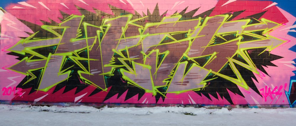
Better Photo:
